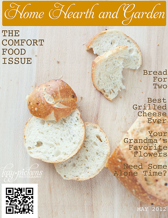
This month’s food photography challenge for our food photography group, The Inspired Plate, was to let a magazine cover give you inspiration to create a cover of your own. I had a fun time with this one. Frustrating and fun at the same time, you know?
So I had seen a food/cooking magazine that had just used bread on its cover. Nothing more. No props. Simple. The image of the cover stuck in my mind. Well, since I’m a prop kind of gal, that seemed like a good challenge for me to shoot without props.
So I came up with this, a simple bread photo. Nothing more, nothing less. No props…
 Okay, I admit, I had fun with the title of the magazine and the “articles” inside of it too…
Though I love to bake, my husband is on a low carb diet so I was loath to actually bake bread in the house with its wonderful aroma. I’m just not quite that mean. I do miss baking bread though, and I’m afraid I’m going to have bread baking extravaganza next time he’s out of town.
I picked up this small loaf at our HyVee store that has a whole table of “bread for two”–small loaves of bread. Love that they have the smaller portions there.
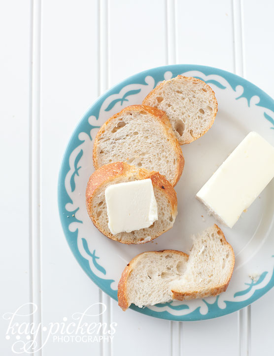
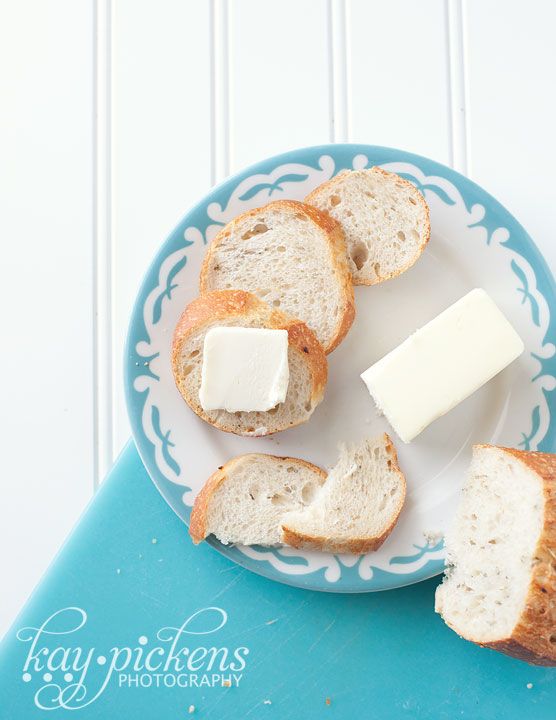
Since it just wasn’t in me to completely NOT use props…I did these quick set ups too.

Love that small teal rimmed plate!
 I used a piece of white bead board and a scratched up teal cutting board. I still tried to keep in mind some open space in these two photos for room for a magazine title and article headlines.
This was a fun project and it was challenging for me to use just the food and no props for the cover. You know , until I cheated and pulled out some props for more photos of the bread.
Jump around our blogging circle and see what everyone came up with. Visit Kat Clark and see her take on the challenge this month.

Comments on this entry are closed.
Absolutely beautiful Kay! I love how you chose bread – it looks delicious and makes a beautiful. Love that plate and teal cutting board! Need to find. 🙂
wonderful cover! I love the composition 🙂
Great job, Kay. Love the choice of blue to go with the crusty bread. Bread and butter, I could live on those alone!
Gorgeous cover!! You are SO talented!
I love it Kay!! It is so clean and your lighting is amazing!! I do like the no props concept once in awhile.. and you pulled it off beautifully. I am also excited about your bottom image. LOVE the colors.. my favs. 🙂 It would be fun to see copy placed in the photo since you made room for it too. xoxo I’m glad you had fun with this challenge!! 🙂
Bread is my favourite thing in the whole wide world to eat! I love the simplicity and the way you placed each slice just so……the teal accent is a nice pop of colour. 🙂
Kay, you have SUCH a great sense of color and props!!! I love that you took the opportunity to challenge yourself to use less props (I have the opposite problem, so I’m very impressed with your prop skills)! Now I am craving bread and butter…true proof that these photos are a big success!! 🙂
I love the simplicity, the earthiness and the rusticness of this cover. The detail on the bread is great and it Excellent choice of background as well. Nice job!
Love how you’ve styled just using the bread – in some ways you have to get more creative when you’re using less props! I think bread is one of the best smells in the world, I feel for your husband on his low-carb diet 🙂
Kay… I love the simplicity of your shot! And yes, I love your titles as well. The creativity is the fun part! I’m working on the reduced carbs as well, but you have me wanting to toast up a baguette and eat it all myself. I’d totally buy this magazine simply because I loved the cover!